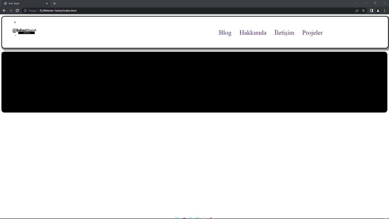
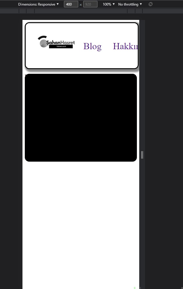
Arkadaşlar esenlikler. Görsellerde eklediğim şekilde mobilde sayfa bağlantılarım kayıyor. Bunları görünür nasıl yapabilirim? Altlı üstlü de olsa olur.
<!DOCTYPE html>
<html lang="tr">
    <head>
        <title> Ana Sayfa</title>
        <meta charset="UTF-8">
        <meta name="viewport" content="width=device-width, initial-scale=1.0">
        <link href="css/style.css" rel="stylesheet">
        <style>
            #navbar{
                display: flex;
                flex-direction: row;
                background-color: #ffffff;
                overflow: hidden;
                justify-content: space-between;
                border-radius: 15px;
                box-shadow: 5px 5px 5px 5px #888888;
                border: 3px solid;
                border-color: rgb(0, 0, 0);
                width: 100%;
            }
            .NavBarA{
                margin-right: 10%;
                text-decoration: none;
                font-size: 32px;
            }

        </style>
    </head>
    <body style="background-color:rgb(255, 255, 255) ;">
        <div id="navbar">
            <a href="https://www.sahanhasret.dev/" style="margin-left:10px;">
                <img alt="Ana Sayfa" src="Assets/LOGO.gif"
                    width="150" height="150" style="margin-left: 20px;">
            </a>
            <div style="display:flex; flex-direction: row;justify-content: center;margin-right: 20%; margin-left: 20%; margin-top: 60px; ">
                <a class=NavBarA href="">Blog</a>
                <a class=NavBarA href="">Hakkımda</a>
                <a class=NavBarA href="">İletişim</a>
                <a style=" font-size: 32px;text-decoration: none;" href="">Projeler</a>
            </div>
        </div>
        <div style="background-color:black ; height:300px; width: 100%; border-radius: 15px; ">
            <p>Deneme</p>
        </div>
    </body>
</html>